Playful Provenance: Why Paper Play Is Suddenly Important
We are collectively building a very particular kind of image across branding, packaging and social design at the moment; compositions built from torn paper edges, strips of patterned tape, foil star stickers, hole-punched confetti and handwriting that has clearly not been over thought. The playful provenance aesthetic reads at first like craving for the school craft table, although what it is actually trading in is authorship; every visible cut, fold and slightly misaligned sticker functions as a small certificate of origin, proof that somewhere behind the artwork there was a desk, a pair of scissors and unhurried, actual making.
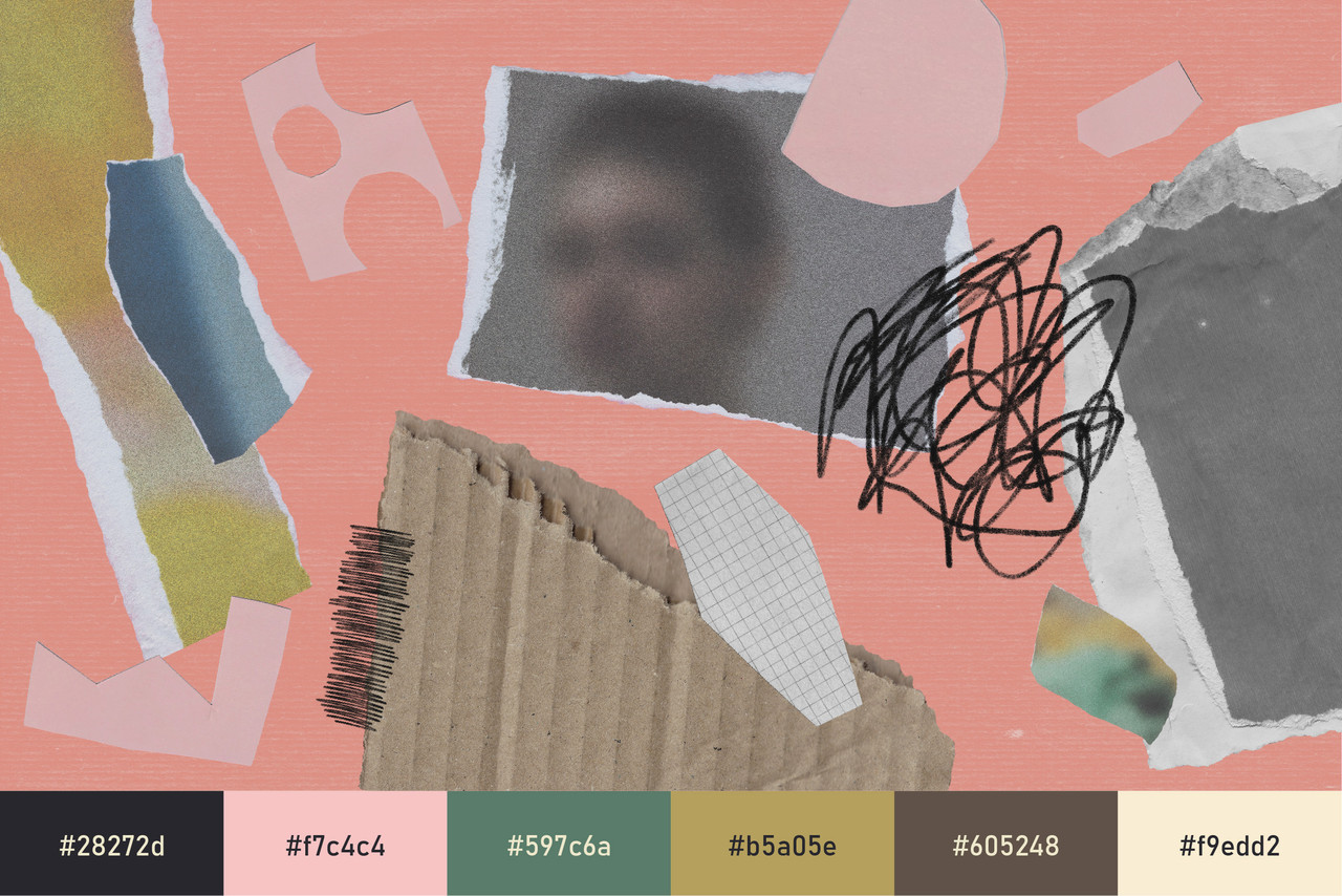
The trend arrives at a moment when design culture is splitting the whole idea of demonstrating human skill into two distinct strands. On one side sits physical provenance, where the process of making is performed in full view and the labour itself becomes part of the message. On the other side sits something closer to intellectual provenance, where the skill lies in stopping intervention at the right moment; proving that an idea is allowed to stand almost untouched because it works exactly as it is, with no gloss or polish applied to apologise for it.
Paper play settles precisely between those two positions, borrowing the visible hand of the first and the unlaboured confidence of the second, which goes some way toward explaining why it is spreading so comfortably across otherwise unrelated categories.
Skill Shown and Skill Withheld
The split is worth dwelling on, because it reorganises what design is currently asking the viewer to admire. The craft-led end of the spectrum performs the making itself: the loom, the kiln, the embroidery hoop, the process video in which raw material becomes a finished object in the hands of a patient maker. The pulled back end performs the opposite gesture, shipping the sketch as the final artwork and refusing the polishing pass entirely, as though adding another layer of finish would only dilute an idea that already holds.
Both are answers to the same audience and that audience has changed; the generation that grew up alongside generative tools is also the first to have cooled on them, with early excitement hardening into a scepticism that treats anything frictionless and flawless as probably nobody’s work at all.
What that audience gravitates toward instead is evidence: visible imperfection, slowness, the marks of real authorship left in place rather than retouched away. In this climate the human hand has become a premium signal – and a brand that demonstrably pays a person to cut, fold, stick and photograph something is broadcasting that it considers its audience worth the labour. Paper play manages to carry both forms of that evidence at once, since the material shows exactly how the image was made while the looseness of the arrangement makes clear that nobody laboured over perfecting it afterwards.
Paper as the Most Legible Material
Part of the trend’s reach comes from the fact that paper is the most universally understood material in visual culture; almost everyone has cut it badly, taped it crookedly and peeled a sticker off its backing, which means the effort embedded in a paper composition is legible to viewers who have never once thought about design. The vocabulary arrives pre-loaded with memory: penpal letters, scrapbook bits, classroom noticeboards, the star chart on a kitchen wall. None of it needs explaining and very little of it can be faked convincingly, because tape holds a real shadow, foil catches real light and a torn edge carries the fibre imprint of a sheet.
There is also a wider mood feeding the material choice. A culture that spent two decades migrating its entire life onto screens is now conducting small, deliberate retreats from the exact same screens; the no phone weekends, the junk diaries. Paper play is the visual language of that retreat, tactile and unhurried and its appearance inside digital feeds works almost like a postcard sent from the offline world back into the online.
Play as the Signature of the Hand
What separates this aesthetic from the broader craft revival is that it asks for no mastery whatsoever. The weaving and the ceramics demand apprenticeship; the foil star demands only that a thumb presses it down, in a way no automated layout would ever choose. The charm sits in the placement rather than the technique, which makes the trend unusually democratic and unusually fast to adopt, since a single sheet of dot stickers is a lower barrier to entry than a kiln.
The playfulness itself is doing a format of cultural work as well. After years of feeds weighted toward crisis, brightness has become something people choose on purpose. A composition of confetti dots and taped-down snapshots reads as that choice made visible, cheerful without being saccharine; light without being careless. It also sits on the right side of a spending mood that has grown noticeably more deliberate; where audiences polarised between the considered investment and the refusal to buy at all have started asking whether a thing visibly cost anyone time; an image that plainly did tends to survive the question.
Translating Playful Provenance Into Pixels
The trend’s weakness is the same as its strength: it is fundamentally physical, and it dies quickly in careless digital translation. The most convincing applications keep the material logic intact, scanning elements at real scale, preserving the soft shadow under every strip of tape and allowing layers to sit slightly out of register, as though the composition had been assembled on a desk and photographed rather than arranged on an artboard. A vector recreation of a star sticker, stripped of its foil glare and its crooked pressure, loses precisely the thing the sticker was there to prove.
Type behaves best when it obeys the same rules, printed or handwritten onto scraps that are then placed into the layout rather than floating weightlessly above it. Motion carries the language particularly well; elements that arrive as though pressed down by hand, dots that scatter with the slight irregularity of things actually thrown, stop-motion rhythms that let the frame perform at a handmade pace. Whites should behave like paper rather than like an optical zero, leaning into ivory, oat and the grey-blue of a ruled notebook page. Likewise, one genuinely scanned element is often enough to lend an otherwise digital composition its full weight of believability.
Why Playful Provenance, Why Now
Feeds saturated with frictionless, automated imagery have made the demonstrably handmade the scarcest visual resource available and scarcity has done what it always does to value. At the same time the culture beneath the trend is pulling in one coherent direction: toward proof of human presence, toward the tactile and the offline, toward optimism held on purpose and toward spending that can justify itself as worth it.
Playful provenance is what authorship looks like once authorship became something that has to be proven rather than assumed. The cut outs, the stickers and the badly behaved handwriting are not decoration so much as documentation; a running record that a person was here, made this and enjoyed making it, left in plain sight because that record is now the most persuasive thing a design can carry.