Mystic Grunge: The Right Amount of Noise for a Tired Internet
Two visual worlds that have (understandably) rarely sat together are quietly fusing inside the current design environment; the mystic, with its slow rituals and unknowable atmospheres and the grunge, with its friction, decay and refusal of polish.
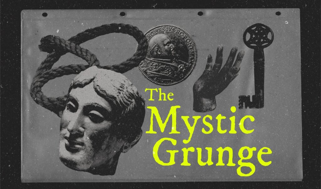
A new aesthetic emerges at the point where these two languages stop cancelling each other out and begin reinforcing the same underlying instinct: a desire for images that feel weighted and somehow unresolved, rather than pressure washed into the same scrollable cleanliness that has defined the last decade of digital design. It is one of many responses to a particular kind of fatigue that the current digital design ecosystem has produced; where every surface has been tested into oblivion, optimised and stripped of the small inconsistencies that once signalled a human presence behind the work.
Where mysticism reintroduces a sense of mystery into motifs and composition that have been explained to death, grunge reintroduces the imperfect process. Together they form a visual language of something moody, mysterious and not entirely legible, which is exactly what a tired audience seems to be looking for.
The End of the Templatised Surface
Template fatigue has reached a point where it can no longer be ignored. The same gradient hero, the rounded sans, the clean isometric illustration repeated across thousands of brands has stopped converting and most importantly – stopped meaning anything to the viewer.
Design systems became so efficient that they managed to erase the maker from the surface, while scroll habits became so fast that the act of looking has been quickly replaced by the act of glancing. The mystic grunge aesthetic breaks that loop by refusing to behave as a system at all (after all, a scanning mistake cannot be standardised without losing the precise thing that made it interesting in the first place).
The Photocopy as Memory, Not Protest
The photocopy has returned, although reading this return as a kind of anti-AI protest is not necessarily true. Photocopied surfaces are reappearing because they are genuinely nostalgic; they carry the visual memory of zines, student noticeboards, gig posters. The sense of duplicated history is something clean vector art simply cannot produce, however carefully it is constructed – and the current cultural appetite for the slightly obscured is finding an obvious home inside this aesthetic.
The most convincing applications treat the photocopy not as a filter applied at the final stage but as the underlying logic of the entire composition; as though the layout had already been duplicated several times to begin with. This shifts the photocopy effect from decoration into structure, where the slight degradation becomes the grammar of the piece rather than a surface flourish.
The Joy of the Mistake
Inside this design language, the mistake is more than welcomed. Scanner streaks, off-register print layers, photos copied in at the wrong contrast and typefaces with an ink bleed are suddenly the soul of the work. The aesthetic restores the hand of the maker, reminding viewers that an image can carry the conditions of its own making without those conditions becoming an embarrassment. A single deliberately uncontrolled element per composition is often enough to keep the whole piece from collapsing back into stock-image territory, which is part of why the approach has been so quickly absorbed across editorial, branding and packaging.
There is also a mood at play that connects directly to the broader cultural moment. The hyper-optimistic millennial branding of the early 2020s, with its coral and mint palettes, friendly rounded sans and overpromising taglines, has aged into something close to embarrassment as the cheerfulness it implied has been outpaced by the actual conditions of the life and years that followed. The trend functions as the visual language of that disillusionment, although it is not depressive so much as honest; the mood is tired, uninterested in performing an optimism that no longer reflects how viewers feel.
Translating the Mystic Grunge Aesthetic Into Pixels
The difficulty with this aesthetic is that it is fundamentally physical, while most of its applications are ironically, happening on screens. The translation has to be deliberate, because the qualities that make the aesthetic convincing in print do not survive a careless conversion into a clean RGB environment. Motion design tends to carry it best, where layered grunge textures can drift across the frame, type can reveal itself by being scratched off rather than animated in and small frame-jitters can introduce the stop-motion quality that gives the work its handmade weight.
Colour decisions play a quietly enormous role in keeping the aesthetic intact across digital environments. Black should never be treated as a true void; it carries a tinge of warm brown or cool blue. White is treated with the same care, leaning into ivory, oat, dust or any tone that admits to being a real surface rather than an optical zero. The palette overall should even feel slightly damp, as if the file somehow remembers the paper it might have lived on. When those decisions are made with some sense of an intention, the aesthetic survives the journey from print logic into pixel logic without losing the body that defines it.
Why Mystic Grunge, Why Now
The arrival of this aesthetic at scale is not coincidental; audiences have begun gravitating toward work that holds more atmosphere and less certainty – and design is following this migration. The mystic grunge aesthetic meets this by offering an image language that resists the smooth and the explainable, while keeping enough structure underneath to remain useful for brands, editorial work and motion.
It carries a healthy appetite for the moody and mysterious, which has been showing up across adjacent cultural spaces; in renewed interest in tarot and ritual, in the resurgence of zines and risograph print, in the slow-horror tone of contemporary fiction and in the broader return to handmade craft. Mystic grunge is in fact what design looks like once the gloss wears off; warmer in its blacks, dimmer in its whites and finally comfortable with its own wonky grain.