Naïve Doodles: Why Hand Drawing Is Taking Over Branding
Some of the most interesting brands right now look like they were sketched in the margins of a notebook rather than built inside a rigid brand system. Naïve doodles; hand-drawn lines, imperfect lettering and playful scribbles are helping brands feel more human, more spontaneous and much easier to connect with. In a landscape full of polished templates and overly smooth visuals, hand-drawn branding stands out because it feels personal, like something an actual person made in a moment of joyful inspiration.
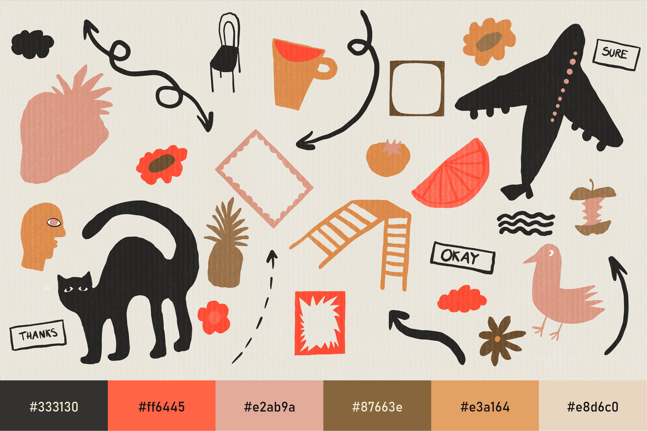
Naïve doodles are not about bad skills or bad drawing. They are about intentional looseness: shaky outlines, uneven shapes, casual symbols and handwritten typography that convey a sense of immediacy and intimacy. Instead of relying on sleek minimalism, this style builds character through scribbles, smiley faces, arrows, stars, faces, and other little visual notes that feel spontaneous and improvised. The result is branding that feels less corporate and more conversational, as if the brand is speaking in its own handwriting.
This approach often borrows from familiar visual languages: school notebooks, sketchbooks, zines, and hand-decorated planners. When viewers see these naïve doodles, they are reminded of doodling in the margins during class or sketching ideas on scrap paper. That emotional memory is powerful; it signals play, curiosity and experimentation instead of formality or perfectionism. For brands that want to feel approachable, community-oriented or playful, tapping into this naïve doodle aesthetic is an easy way to convey the right feeling before anyone reads a single line of copy.
What Makes Naïve Doodles So Distinctive
Naïve doodles stand out because they embrace visual “mistakes” and turn them into a signature style. Shaky outlines, uneven spacing, off-register fills and overlapping elements are not cleaned up in post-production; they are the point. Paired with handwritten fonts, playful arrows or chunky marker underlines, they create a brand language that instantly reads as personal and unfiltered.
Beneath that apparent looseness, the strongest examples sit on simple, smart layout decisions: clear hierarchy, generous spacing and limited colour palettes. The doodles provide the personality layer, while the underlying grid keeps everything legible and usable. That balance is what stops the style from feeling like random scribbles.
Naïve doodles also bring motion to otherwise static compositions. A doodled arrow can guide the eye to a call-to-action; a cluster of tiny icons can frame a product shot; a scribbled speech bubble can highlight a key quote. These small gestures direct attention and create little narrative moments inside a layout. For brands that communicate complex ideas – education platforms, service businesses, or product-led brands – those tiny doodles can break information into ‘friendlier’ pieces for the viewers’ eyes.
Colour and texture play a huge role in how naïve doodle branding lands. Many of these identities lean into crayon-like primaries, soft neons, or flat pastels that echo markers, crayons, and highlighters. These colours are often applied as blocks behind text, as underlines beneath headlines, or as rough circles and shapes that frame key information. Paired with visible texture (paper grain, pencil strokes, scanned ink marks), the brand feels tactile, even on a screen.
How to Use Naïve Doodles in Your Branding
Naïve doodle branding works best when the hand-drawn elements are treated as a flexible system rather than a one-off effect. Start by choosing one or two handwritten fonts that feel casual yet legible; these are ideal for headlines, taglines and accent text. Then create or source a set of doodle assets: arrows, stars, frames, speech bubbles, simple characters and other small elements. This becomes your visual vocabulary, ready to be mixed and matched across campaigns, social posts, packaging and presentations.
Naïve doodles shine when they are layered into small visual worlds: a character pointing at a discount code, doodled frames around screenshots, notebook-style margin notes next to a testimonial. Social media templates are an ideal playground for this, because you can reuse the same set of doodles in countless arrangements while keeping the brand instantly recognisable.
Why Hand Drawing, Why Now?
Naïve doodles are thriving in a moment when audiences are sceptical of anything that feels too polished to be real. After years of glossy gradients, corporate flat design and increasingly synthetic imagery, rough-around-the-edges visuals signal something different: there is a human behind this after all. A wobbly line or slightly uneven letter intuitively reads as effort and imperfection, which often feels more trustworthy than perfection.
There is also a strong nostalgia and comfort factor at play. Naïve doodles tap into memories of school notebooks, sticker-covered binders, and afternoons spent drawing for no reason other than joy. In a time of constant optimisation and performance, that just-for-fun energy feels refreshing. Hand-drawn branding offers people a brief respite from the overly curated visuals they are used to seeing.
For brands, adopting naivety into a design is more than a passing look; it is a strategy for signalling warmth, personality and approachability in a crowded, polished market. By intentionally leaving the human hand visible – through doodles, handwriting, and sketchy details – brands can build visual identities that feel less like institutions and more like living, evolving stories.