The Primordial Trend: Shells, Sea & All Things Earthly
In moments of political instability and intense cultural fragmentation, there is often an instinct to return; not to regress per se, but strive inwards toward something slower and more elemental. The Primordial trend emerges from that instinct. This particular trend reflects a growing cultural desire to re-establish intimacy with the organic and the earthly, positioning the earth itself as both archive material and guiding force.
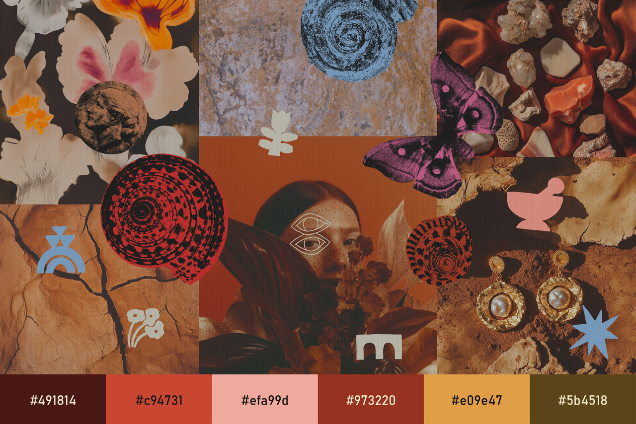
It is the meeting point between sea and land, where saltwater hardens into shell and sediment settles into clay. It feels ancestral and bodily, textured as well as mythic in many ways. It leans into crimson, ochre, soil brown, and muted blue tones, allowing colour to feel saturated with memory. The Primordial is essentially the aesthetic of terrain and tide, of ritual and return; amplifying surfaces that appear worn, imperfect.
The Primordial Trend: Where Sea Meets Soil
The Primordial, in this context, is specifically about the point where the sea meets land and therefore carries motifs of both sides – sea shells and all things murky as well as terrain themed, such as sand and clay.
Shells appear often, though not polished. They are gritty, dinged by the tide, weathered by time. Their surfaces hold texture and irregularity, and when placed against clay backdrops, rough linen, or velvet reds, they become relics rather than ornaments. Sand and soil also feature as the protagonists. Cross-sections of rammed earth, cracked clay, sediment layers, and rough stone become compositional anchors.
Colour palettes navigate between deep rich reds, oxblood and crimson tones, softened by bone, stone, and pale seafoam blue tones. These combinations bring about images of both flesh and mineral, tide and terrain. There is warmth, intermingled with mineral coolness.
Texture, as expected, dominates. Velvet folds, cracked clay catching light, freckled surfaces that celebrate irregularity. A particularly popular motif, the pearl, is showcased in many a setting, resting on soil, fabric.
Even the mark-making echoes urgency. Quickly sketched line art appear often, drawn as if in haste. These gestural lines, uneven and unpolished, introduce a human immediacy that balances the weight of heavy imagery such as stone and shell.
Feminine, Ancestral, Maternal
This aesthetic is both an extension and a reaction to the ever-evolving women’s rights movement; particularly touching on the fact that all life – primordial and contemporary – comes from women.
Symbols of abundance are frequent; fruit split open, abundant and jewel-like; figs and pomegranates clustered intentionally, echoing themes of fertility and harvest. Singular florals are also a popular design element here – they stand alone and command attention.
Expressionist brushstrokes rendered in gouache are the primary painterly choice. Deep ochres, clay browns, and saturated reds are applied imperfectly, edges left soft or irregular. Ultimately, the tone is deeply ancestral yet contemporary. It feels intensely protective, rooted, maternal in the broadest sense of the word.
Typography within The Primordial trend should feel storied, sensual, as though carved, printed, or pressed rather than digitally assembled. Elegant serif typefaces with elongated curves or subtly eccentric details echo the mythic and feminine undertones, while imperfect letterforms or softly uneven baselines reinforce the human hand.
Avoid overly sterile sans-serifs; instead, lean toward typography that holds weight and character. Spacing should be generous, permitting single words or titles to stand monumentally against textured backdrops, so that type becomes not just information but a relic or inscription.
Where This Aesthetic Works Best
In graphic design projects, deep earthy palettes paired with elegant but rough serif typography will create a sense of the mythic. Spacious layouts allow single motifs; shells, florals, fertility icons; to breathe against textured backdrops.
In packaging, tactile materials will amplify authenticity. Uncoated paper stocks, embossed details, rough finishes, and natural asymmetry reinforce the connection to soil and stone. Velvet ribbons, matte labels, and mineral-inspired colourways will also enhance the ritualistic tone.
For social media and marketing, imagery will benefit from an editorial touch: analogue grain, imperfect framing, moody lighting as well as compositions that foreground texture over anything else.
Why Now
In an overwhelming world of information and seemingly endless imagery, there is a growing desire to simplify. We are gravitating toward the subconsciously understandable: quick line sketches, single florals held in isolation and simple but powerful textures; clay, shell, soil, stone. These elements register somewhere older than language, offering forms the mind can process gently and instinctively amid digital excess.
There is deep comfort in amplifying what we already know but have somehow forgotten. The curve of a stem, the symmetry of a shell, the grain of cracked earth; these are ancestral patterns embedded in collective memory. In returning to them, The Primordial becomes a visual exhale, distilling imagery down to what feels familiar, elemental – as well as safe and enduring.