Inside Ayya Studio: Cinema, Travel, and a Shared Creative Life
Ayya Studio’s work has that rare authentic feeling you notice right away: hand-drawn, intentionally imperfect, and deeply personal. In this conversation, we take a deeper dive into Ayya Studio’s creative journey, from early obsessions with film typography to the role travel, nature, and music play in their process, and the thinking behind their latest release. You can explore more of their work over on Creative Market at <https://creativemarket.com/AyyaStudio>.
What does Ayya Studio mean and how did the name come about?
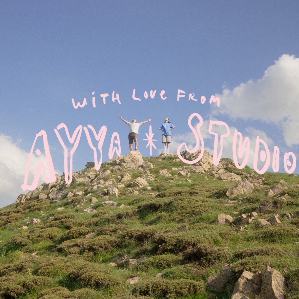
We’re partners in both life and work, and honestly we’re just two people who love making beautiful things together. The name Ayya Studio is a bit of a mirror for us. It reflects how we’re constantly bouncing ideas off each other and how our personal and professional lives are completely intertwined.
What inspired you to pursue graphic design in the first place? What were you working on before?
We’ve both been into art as long as we can remember. As kids, we were always drawing, watching movies, and just soaking up everything visual. Transitioning into graphic design felt like the most natural thing in the world. It’s basically our way of turning gut feelings and random ideas into something you can actually see and touch.
Cinema has always been a huge part of our world. Even when we were younger, we didn’t just watch the story, we obsessed over the details, especially the typography. Finding a font in a film’s opening or credits that just works has always been a wow moment for us. It still is.
When creating a new product, where does your creative process usually start? What inspires you?
People often ask where we start. To be honest, it usually begins with a bit of magic, a moment where something just catches our eye and sticks. When you spend your life looking at art, movies, and the world around you, those impressions eventually need an outlet.
That’s how a simple observation turns into a font, an illustration, or a full branding project. Inspiration really is everywhere, in music, in honest conversations, or just in how people act.
Are there specific eras you draw inspiration from? How do you reconnect with those aesthetics?
We’re especially drawn to the 70s and 80s. There was so much weird and wonderful self expression back then, and that freedom still feels very alive to us.
Music usually sets the tone. We don’t really plan it, but the right Spotify playlist often ends up shaping the entire mood of a project, guiding how expressive or restrained it becomes.
What is your creative process like?
Our process is pretty straightforward: moodboards, lots of sketches, and a looot of tea. Sometimes we spend days overthinking things, and other times one strong image is enough to spark the whole idea.
After more than ten years in the industry, across branding studios and personal projects, we’ve learned that visuals aren’t just about looking cool. They’re about communicating a specific feeling.
Where are you currently based and how has this location inspired your work?
Nature plays a huge role in how we stay inspired. We hike as much as we can because being outdoors is the only thing that really helps us slow down and clear our heads.
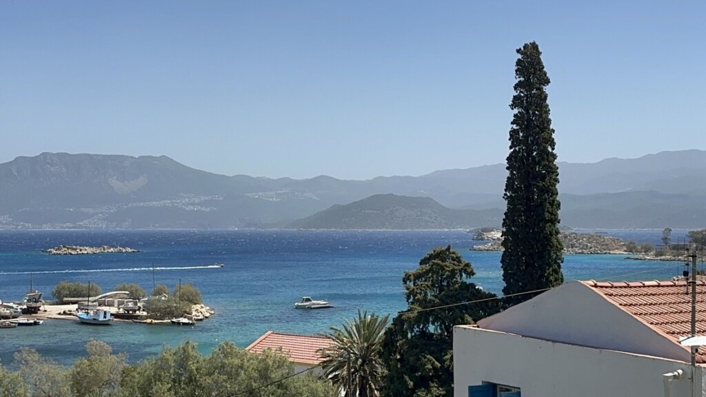
Travel is another big trigger. Last summer, we spent some time in Greece, and the light and atmosphere there were just incredible. We actually ended up releasing a series of summer themed fonts right after that trip, they were a direct result of that mood.
Museums and exhibitions also matter a lot to us. Seeing art in real life, its scale and texture, gives you insights you just can’t get from a screen.

Out of all the products you’ve designed, which one is your favorite and why?
Choosing a single favorite product is almost impossible because everything we create is made with care and attention to detail. That said, our Aperitif font holds a special place for us.
It was designed and released in a single day, driven by a very strong and clear visual idea. The font captures a vintage mood while remaining incredibly versatile, which is exactly what we love about it.
What was the inspiration behind your latest font, Pop Hearts Studio, in collaboration with Creative Market? Which brands do you see it being a better fit for?
Pop Hearts Studio is a bit of a love letter to vintage fashion illustration. We pulled a lot of inspiration from old school fashion houses like Schiaparelli and from bold, hand-drawn editorial looks.
We also kept thinking back to Andy Warhol, not just the pop art work everyone knows, but his early illustrations and the way he mixed type and image so effortlessly. We actually had the idea for this project years ago after seeing one of his shows, and it just sat in the back of our minds until now.
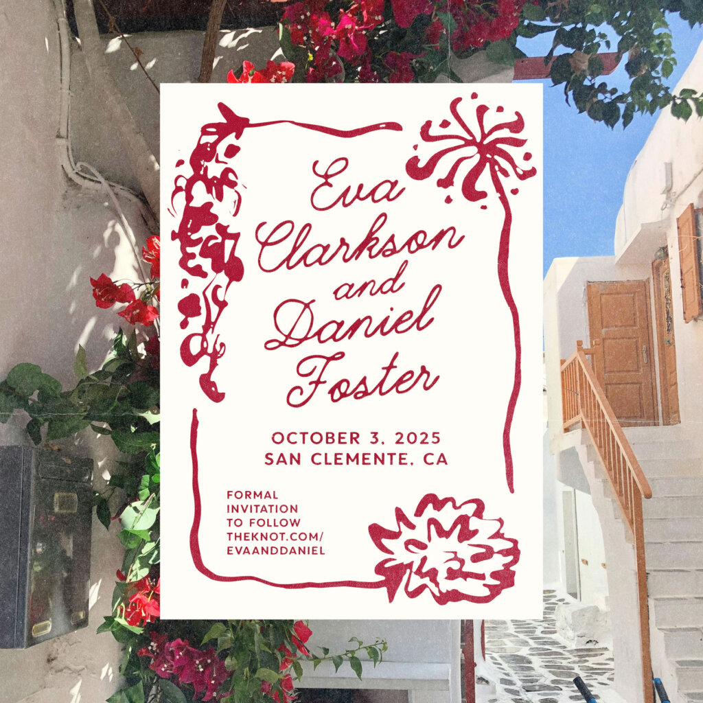
While you could definitely use Pop Hearts Studio for wedding stationery, we really see it shining in fashion forward projects, brand launches, lookbooks, or expressive social content.
Lastly, where can readers learn more about you and your work?
Lately, we’ve been really focused on typography, with several exciting font projects coming up this season. At the same time, we’re still working closely with branding clients, many of whom find us through Creative Market.
One of our favorite recent moments happened after one of our fonts was featured on the Creative Market homepage. Shortly after, a client reached out to collaborate on the branding for Birdie’s New York, a new frozen yogurt shop in Manhattan’s West Village. We designed the logo, illustrations, and menu typography, and seeing our work come to life in a physical space was incredibly rewarding.
You can explore more of our work and releases on Creative Market, and follow along as we continue to turn mood, memory, and observation into typography and design.